Showing posts with label design skills. Show all posts

Friday, January 11, 2013

Designing postcards with vector software

A quick explanation for those not familiar with graphic design: Vector graphics are graphics that are built up from mathematical expressions. Vector graphics (images and/or text) can be zoomed in and out infinitely without loss of quality, whereas a bitmap image like a digital photograph image would become blurry and pixelated at a certain point. Thus, one of the advantages of vector illustrations is that once you've created it, you can use it on any size you want, be it a post stamp or a poster, and still have crystal clear lines.

Lots of people use Adobe Illustrator to create vector graphics, but the software I'm using is Inkscape. It is a free (yay!) open source program, and is not as heavy for the computer compared to Illustrator. However, I generally never liked to work with this type of software, be it Illustrator or Inkscape or anything else. I generally didn't like working on graphic design at all, to be honest. It has been on my 'have to practise' list for many years and I've always managed to put it off.

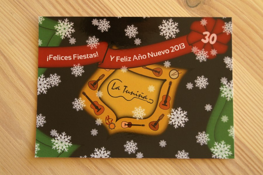
Until I entered the board of my music group, and a Christmas card had to be designed. Within two weeks. And with me being the only board member active in the field of design, it was kinda sorta not much of a question who would befall the 'honor' of this task. Great. Ahem.

So, no more excuses. I had to start creating something. I chose to do it in Inkscape so I would finally get some real experience with it. The result:

Considering the fact that it is pretty much my first complete graphic design ever (apart from smaller things like my logo and business card) and that I was not that familiar with the software, I don't think the end result is that bad. And even though I have been cursing now and then during the process, no complete mental breakdowns took place which was nice as well. Okay, I did say "never never never again!" a lot of times to my friend and fellow board member, but I had pretty much already forgotten about that a day after ordering the cards.

A good thing, because after ordering the postcards (a lot of them) via Greetz, I got an email: 9 postcards to print for free! Some sort of bonus you get after ordering apparently. Nice! No one else wanted to do something with it and the cards had to be ordered within a month, so I took the opportunity to give myself an additional challenge: design 3 or 4 postcards just for fun, learning additional Inkscape skills and graphic styles in the process.

So, there was an incentive (seeing your design in print is actually pretty cool), motivation (graphic design was more fun than I had thought) and not completely unimportant, a deadline. I find that deadlines increase my general productivity a lot, because it prevents projects from dragging on and on and ending up abandoned halfway.

Combining that with a short Christmas holiday and some extra days, and there you have it!

My first design (blue card) was according to this tutorial on urban design. It's a graphic style you see quite often and I've always liked the circular designs, so it was nice learning how it is built. I really love how it came out. Also that it looks still quite different from the example in the tutorial, it's nice to see that personal style comes out even when following instructions.

My second design (red card) was pretty much free form, trying to create a shape and fiddling with it until I liked how it came out on the card.

For my third design (green card), I learned to add textures in Inkscape. A texture is what you can see on the background, a combination between a simple colour and a picture (this one is of rust, from this site with free textures). It gives an illustration a sudden burst of liveliness and character. Creating a simple text and a shape of a flower, and the card was done.

The fourth design (yellow card) popped up in my head and I just tried creating the look and feel I had envisioned, which was quite difficult. Although still different from what I had imagined, the cheerfulness came out just how I wanted it!

I love how quickly your skills improve after tasks like this. For me, it has become much easier to envision and come up with graphic elements (and how to create them) compared to a month earlier. To keep growing, I decided to create a desktop wallpapers for every month in 2013, that can be downloaded before the month starts (there: a deadline). Okay, January will be too late, but you'll see it soon!

Tuesday, January 8, 2013

'People in Interaction' challenge

Drawing people is hard. It requires insight in anatomy and the way people move, general drawing skill and a lot of practise to get things right. Because product design often requires images to communicate how an object is used, being able to draw people is a rather useful skill.

To gain some much-needed practise in this field, I did a 15-day drawing challenge: "people in interaction". Every day, pick an item and draw a person interacting with that item three times, with different interactions or viewing angles. Phew! Talk about challenging!

I cheated big time on the hands and faces, because they are a drawing skill in themselves and will need a separate study to get it right in drawings. Trying to draw those correct as well now would've driven me to insanity, so yea... Mañana, mañana...

After doing this challenge I definitely feel I'm having better grip on drawing people. Of course I still need a lót of practise and study, but it definitely got easier (and faster) along the way. Doing a challenge like this also gives a better understanding of your 'problem areas', in my case I really have problems drawing hips accurately. Also, clothes and drawing poses with arms raised in the air could use some special attention.

Sometimes I used reference pictures to get certain body parts right. A good source for reference pictures (both full body, specific body parts and expressions) is Kxhara at Deviantart. I love her pictures, they are very convenient!

Sunday, November 11, 2012

A lesson on why to listen to your elders

"Drawing skills", my coach in university once said, "are the most useful tools a designer could ever have". And he added that during his education, he would have drawing practise for at least one-and-a-half day per week, for several years.

Well, than it stands to reason that my drawing skills are not on par with those of traditionally educated designers. My education was more of the "define you own curriculum" kind and I've always considered function to be highly superior over form. Therefore, spending an eternity on practising how to make 'pretty' drawings was not very high on my list of priorities.

Until now.

It started when, after graduating, I started to use more sketches and doodles during brainstorms. After a while, I noticed that the ones with the better-looking sketches were far more pleasurable to go through again and again, and that browsing through those sketches would give me lots of enthusiasm and motivation to continue working on the concept.

Now, I highly prefer working on paper compared to making digital drawings (or worse: only descriptions with no pictures at all). Even though digital drawings or renderings can be much more precise and beautiful (and not to mention, there is an 'undo' function that paper sadly lacks), when it comes to brainstorming and concept development, drawing on a sheet of paper gives so much more freedom. On paper it is so much easier (at least for me) to put down your train of thoughts, ponder, compare, take it with you, make some minor adaptations etcetera.

There is just something about a drawing that cannot be captured in words. Even though words are often needed to emphasize or explain aspects of the design, a drawing communicates so more about the idea or concept. That is, as long as the drawing is accurate.

And there's the challenge: making drawings that are both accurate, aesthetically pleasing and not to mention drawn quickly. That calls for quite some skill... Maybe the extensive drawing practise was not such a bad idea after all!

During my "Sleek & Futuristic" challenge, originally meant to discover the form language of sleek/futuristic looking items, I rediscovered and tried out new drawing techniques. I learned a lot, although I cannot say I already have a good grasp on how to make something look futuristic or sleek, but my understanding definitely improved and that's what I was aiming for. The rest will come over time, I'm sure.

The first days, I was really lost on how to start, but after studying reference pictures it became easier. I used 3D software (1 and 4), pencil sketch on paper (2) and digital drawing software (3).

Two more 3D modeling software renderings (5 and 7), and pencil sketches (6 and 8).

After that, the challenge turned more into a drawing training assignment. I even started to use markers (day 10 to 14), which I hated during my education. And I liked it! I also discovered the awesome effect of drawing on colored pape, using a sharpie (Dutch: fineliner), grey markers and a white chalk pencil (day 10 and 11). Whoa!

As you can see, I still have a LOT to learn and train when it comes to perspective, shading or even just setting straight lines. That's fine. I'll just need to keep on practising and experimenting, and then maybe, maybe after a looong time, I'll even reach the level of a classically educated industrial designer!

For those of you who are interested in using markers for drawing, here is a nice tutorial on how to use them. The website idcreatures.com (I'm a fan) has many more of those, very convenient if you want to learn more about making product drawings.


My next challenge will be drawing people in interaction with objects - talk about challenges!